Description
Brand design for an AI Saas.
The challenge
AI analytics tools live in a saturated space where brands default to cold, tech-heavy visuals. Quantum Pulse needed a mark that felt intelligent without feeling authoritative.
The strategy
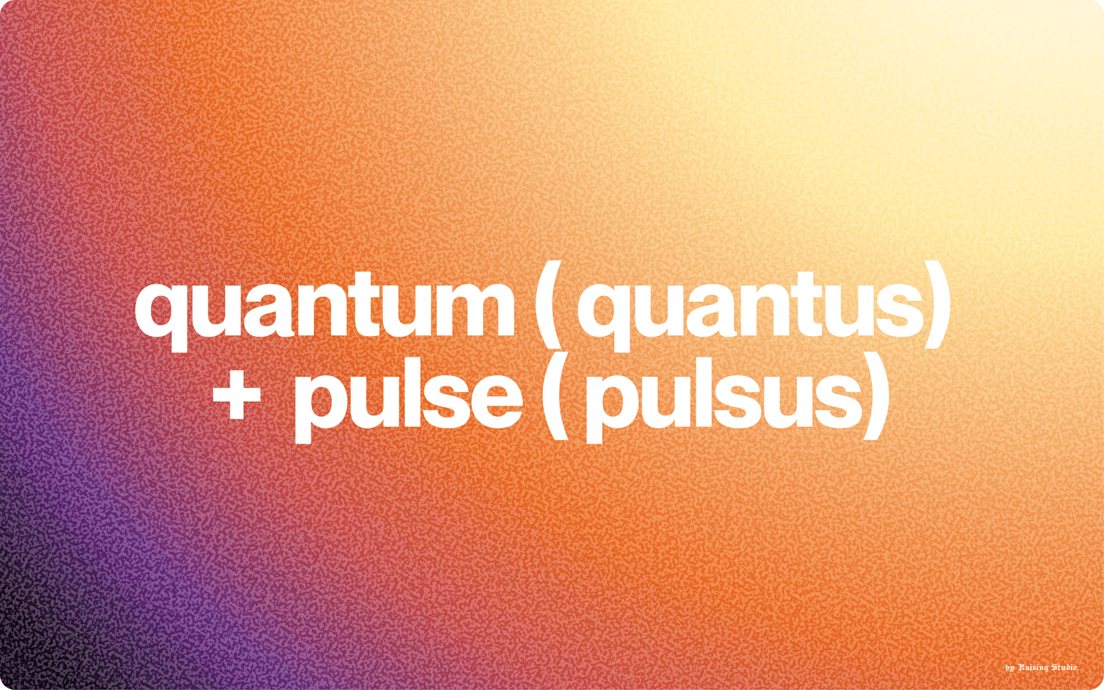
Ditch the tech clichés. I wanted something that felt alive : a shape that grows, not one that computes. Orange because it's optimistic and creative without being aggressive. Warm enough to be safe, structured enough to be taken seriously.
The identity
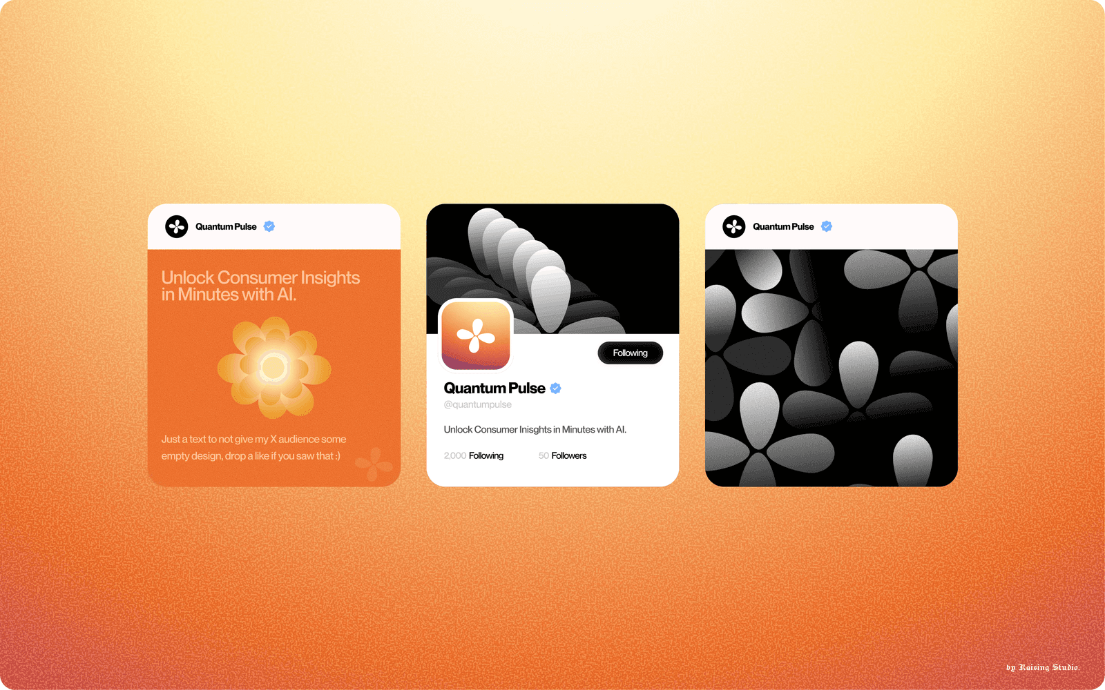
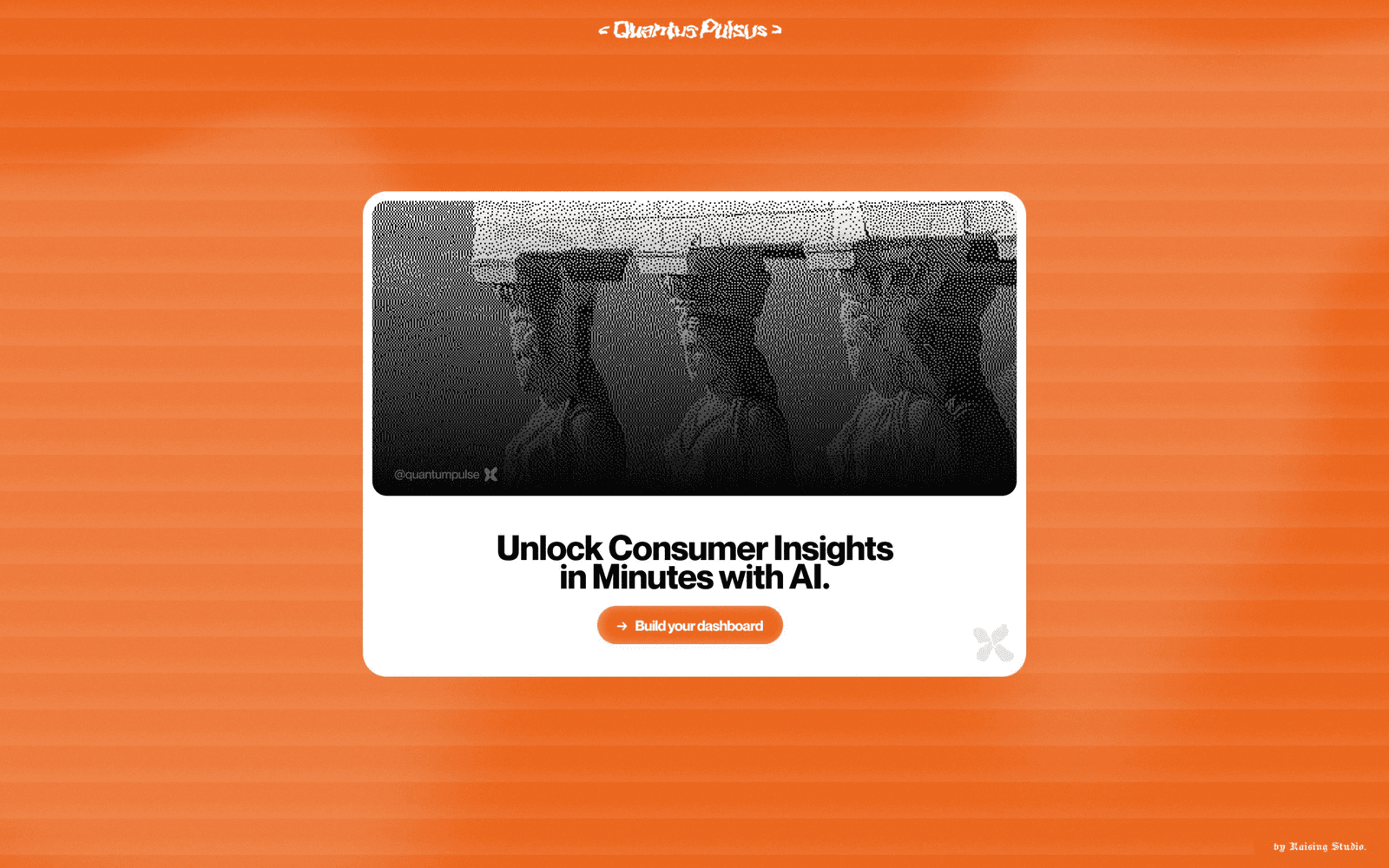
A geometric petal mark symmetrical, modular, and instantly scalable paired with a strong word mark. The system flexes from dark app icons to full branded content, always cohesive.
Mockups