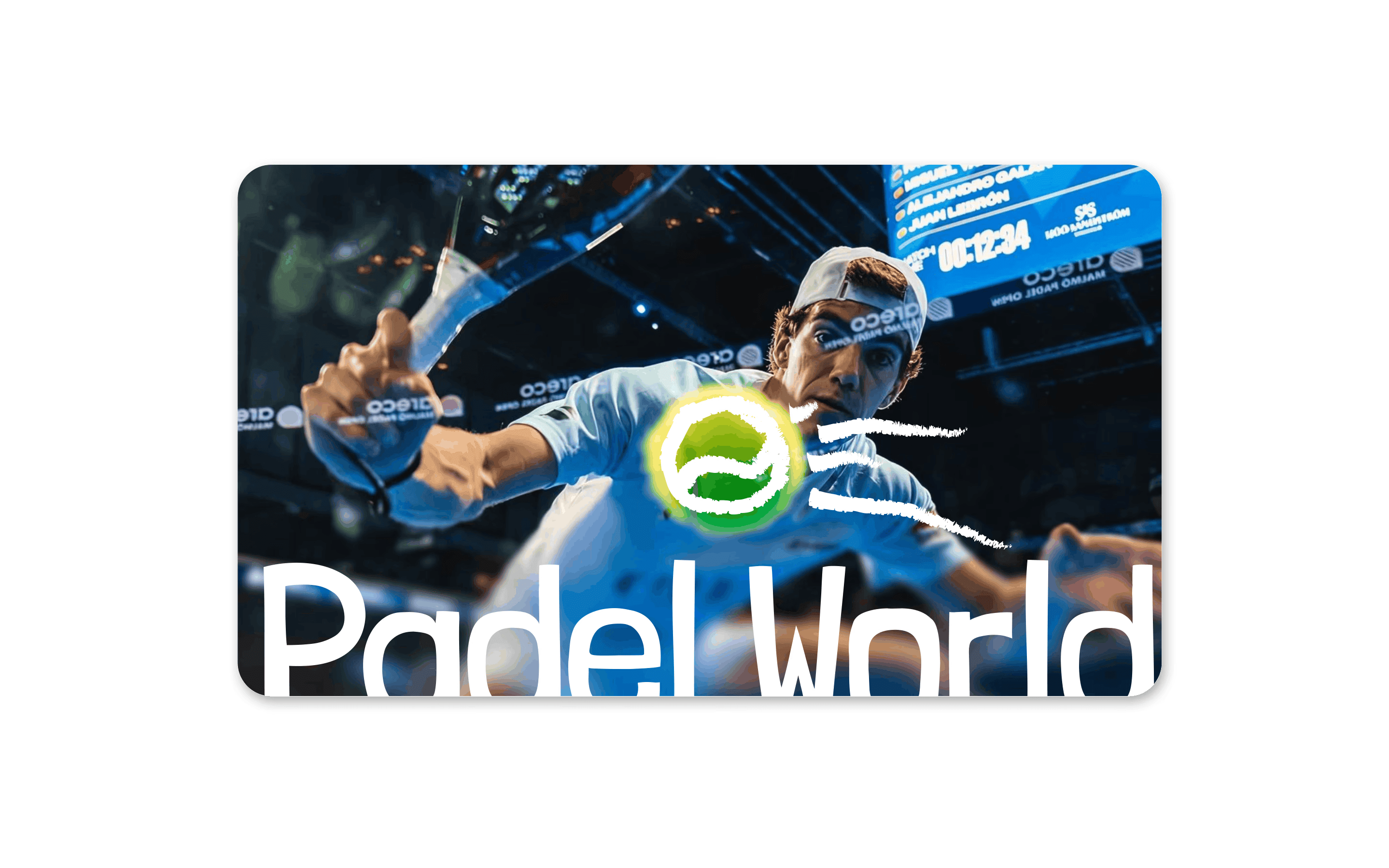
Padel World
Description
Logo and reservation exploration for padel brand.
The challenge
Padel is exploding but most clubs still look like a gym flyer from 2012. Padel World needed to feel like a destination, not just a booking system. The brand had to carry that energy before anyone stepped on a court.


The strategy
Sport brands usually go loud. I went editorial instead with bold type, electric green, and a hand-drawn mark that feels like motion. The onboarding had to match: quick, visual, zero friction. Pick your court, see it, book it.
The identity
A gestural icon : handcrafted ball paired with a heavy word mark that holds the court. The green slash cuts through everything. From a tote bag to a billboard, it always looks like it belongs somewhere cool.


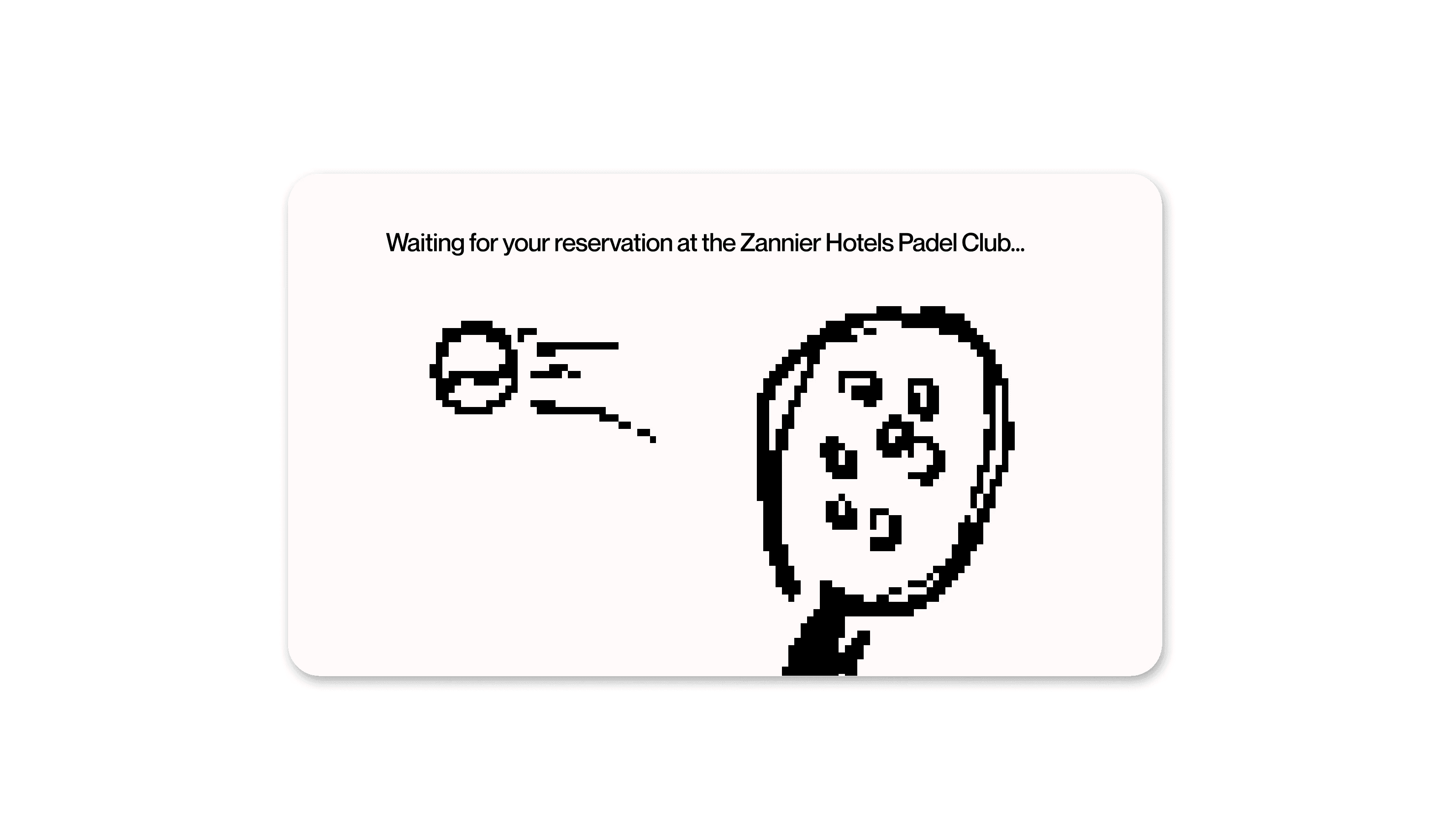


Mockups

